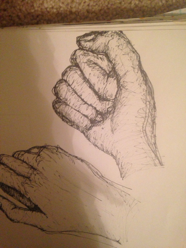
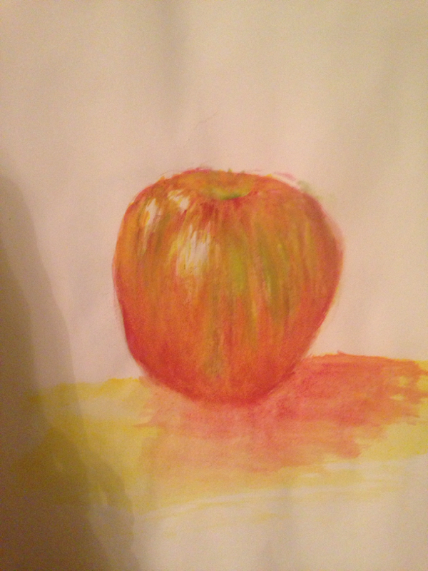
The contour hand drawings and the watercolor mini lessons I think were the most beneficial to me. The contour drawings taught me how to move my hand through the pen with my eye to copy the same shape of the object I was looking at. This helped me later on in bigger projects like drawing the skeleton. I think now I'm better able to accurately resemble shape and proportion. I also enjoyed learning how to use watercolors. Obviously I still need some practice but I think I'll have a good start. In the future I could definitely incorporate the strategies that we're shown to us that can manipulate the material to show texture or other interesting things. Learning how to use the watercolors by looking at apples definitely helped me understand how to use color line and texture with that material. 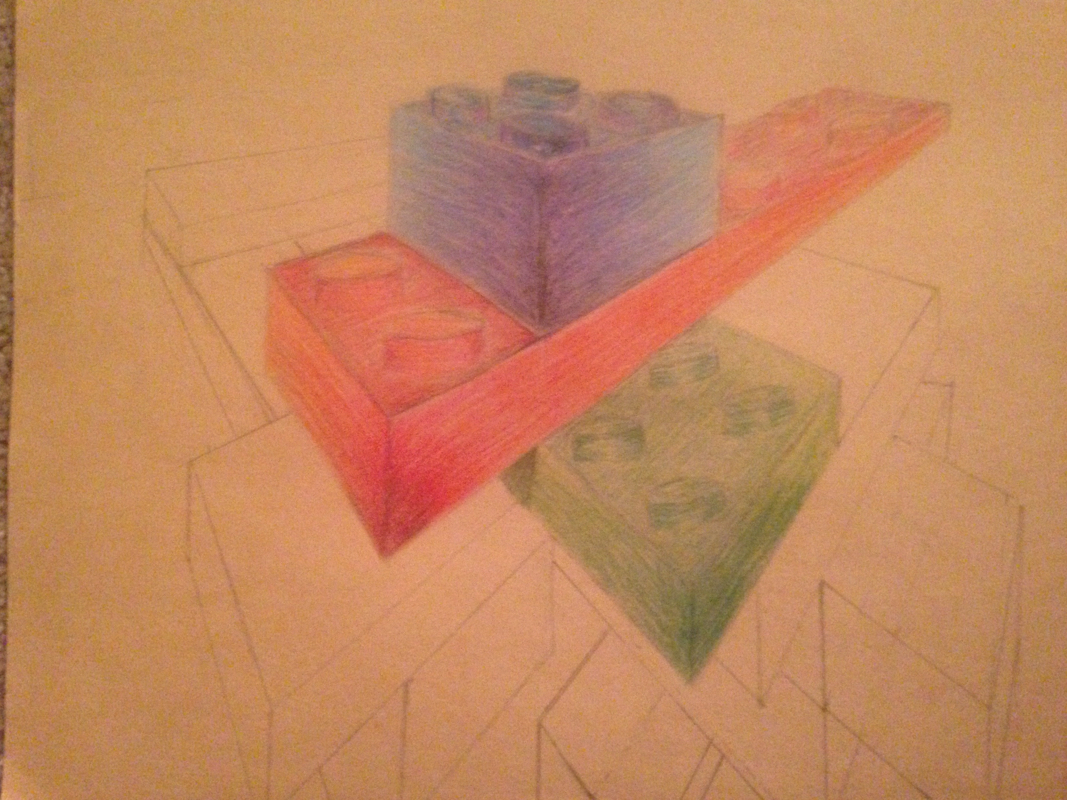
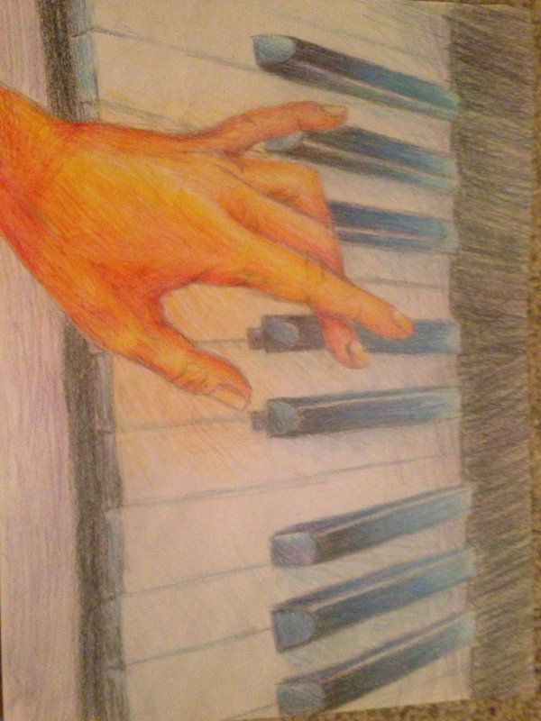
The first photo is a perspective drawing of Legos from the beginning of the semester, and the second is a piano. In both I used colored pencils. From comparing these two we can definitely see that over time I've become able to transition from one color to the next than I could before. once I started using prisma colors that definitely helped it. While drawing the Legos, I had a hard time figuring out the correct size of things. When making the second drawing, I struggled a lot less with finding which proportions were correct in perspective. I think I have a better understanding of the light sources and shadows, as well as certain details, which is shown in the hand in the second drawing. 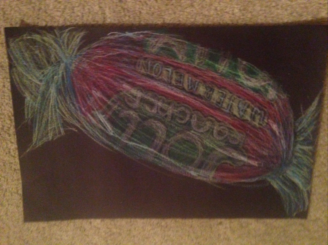
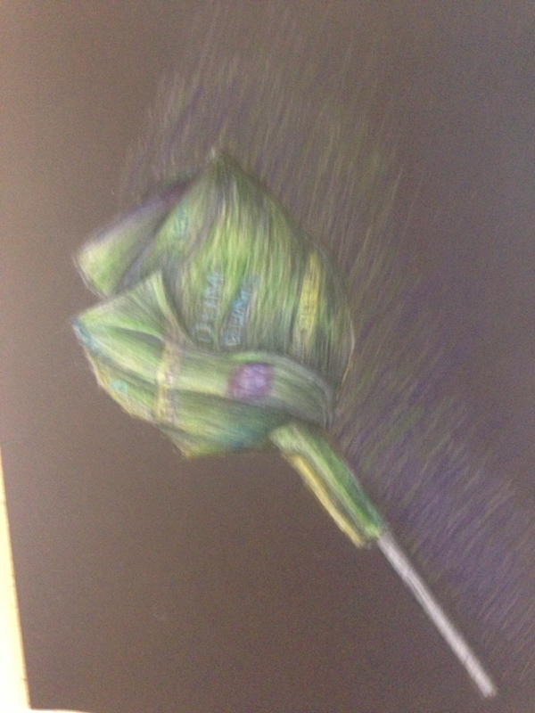
This project I felt was my least successful. It doesn't look realistic, the line work is bad, and overall it just looks sloppy. I think this is because I tried not to spend too much time on it, but ended up resulting in bad work. I also didn't enjoy working with the waxy crayon like materials that we had to use for this. I like to be able to build up layers fast, and with those types of pastels it can't be done. If I could do this piece over again, I think I would want to be patient and take my time with it. I would have also used a lighter sheet of paper since I'm less used to the black ones. It also needs more highlights, contrast, value, color, and better lines near the ends of the wrinkles of the candy. 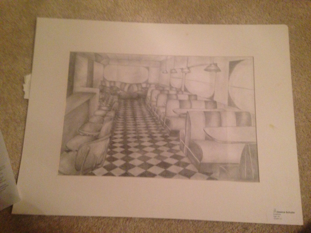
I believe that my best project in this class was my drawing of the diner. This is because I like the composition of it and I think it's interesting. The way I used the technique one point perspective makes it look more realistic as the objects repeat back into the space. I became more familiar with the use of different kinds of graphite pencils, as well as learned how to blend using a tortillion. In the future, I definitely would use this information in my new pieces. I went through a very long process of compositional sketches and adding value. These took especially a long time because of my indecisiveness with planning and how my piece incorporates so many different objects. It took too long to finish everything, but I am pleased with the end result. 
This was my multi media project. I used a dollar bill, ribbon, coins, glitter, tissue paper, paint, and wrapping paper. This was supposed to represent a Christmas theme, that could connect with the amusement motif that was assigned to us to use. This has many layers, but I regret not making the paint and gesso more see through so it would be easier to see the things underneath. I also expected the corners to be more green, but it ended up being more blue, which I'm not really happy with. I'm also not happy with the red paint, I think it's too pink. If I had more money, I would have done the Christmas tree entirely with dollar bills, but I'm happy with how the tree turned out. In general, I don't think this project was one of my best; probably because the strategy and medium is so new to me. I really like the idea of this type of work, and I'd definitely want to try it again outside of school where I would have more time and access to better materials. 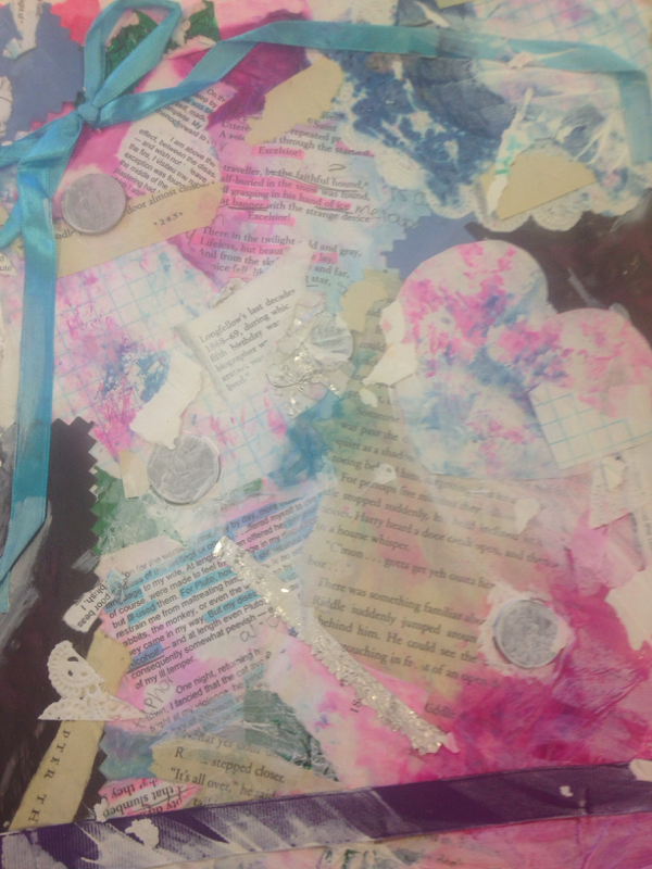
This is one of the journals I used in planning. I used book pages, text, gum wrappers, coins, and graph paper. I like the way the colors fit together.a lot of it was basically what I could find in my backpack. 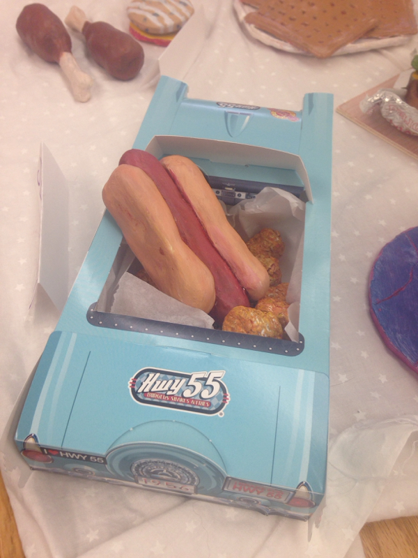
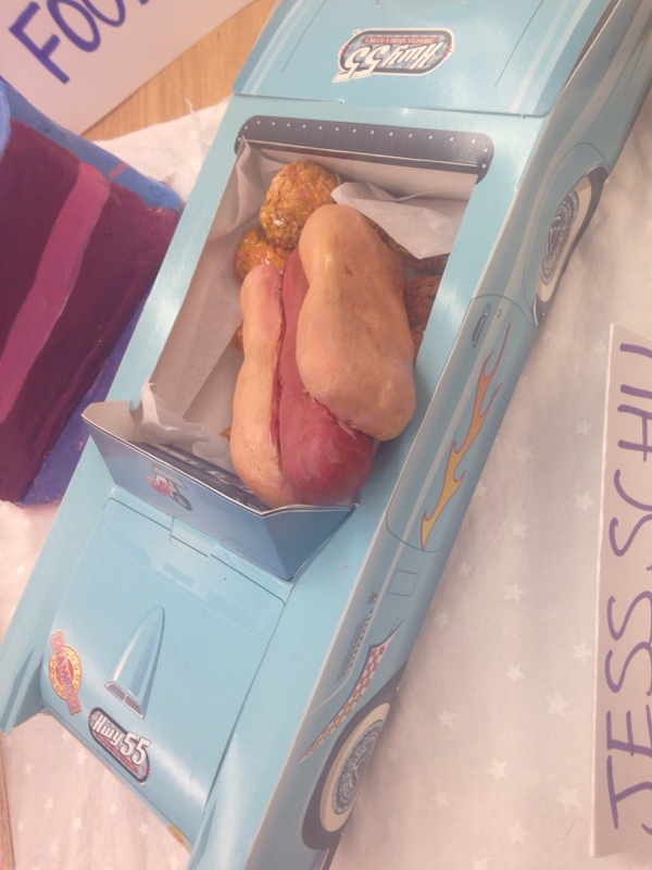
This was my final project for the clay tile project. I made a hot dog and tater tots. 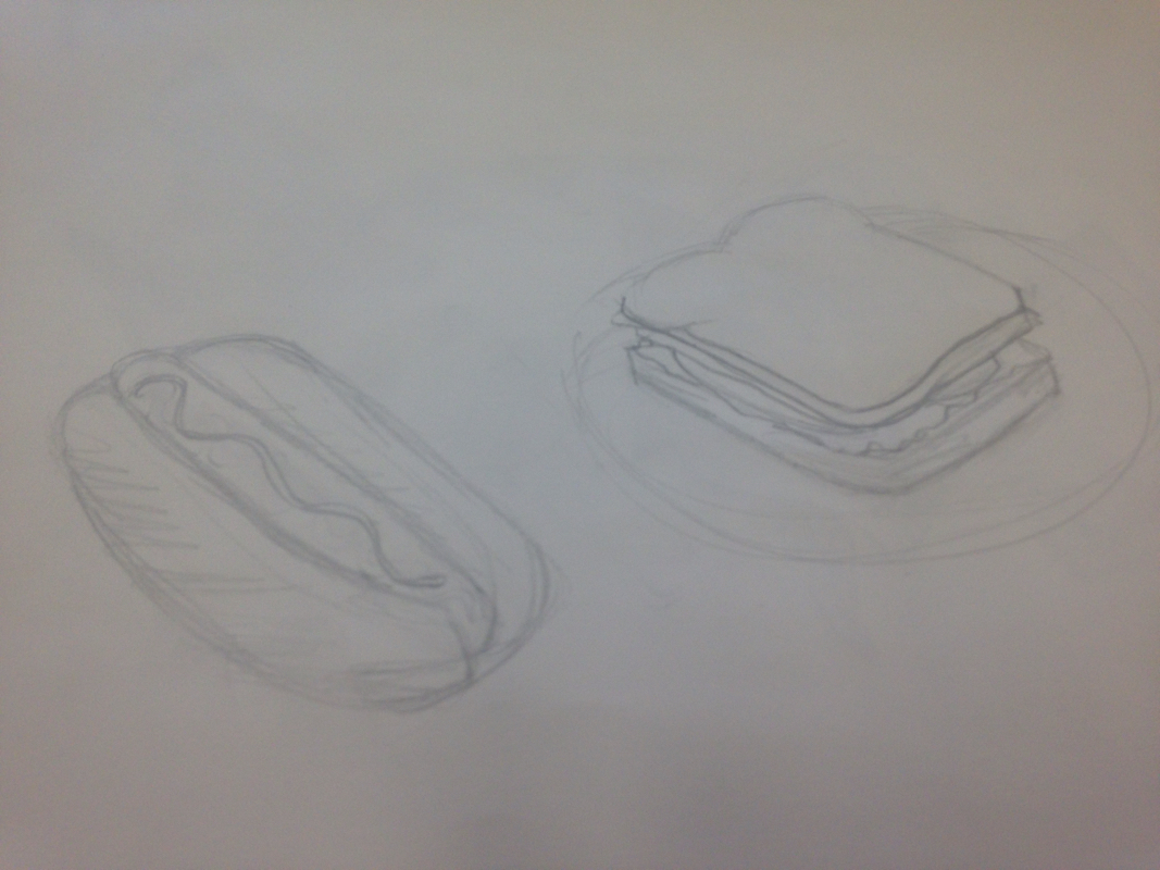
This was my original sketch. At first I planned that I would do a sandwich and a hot dog. But then I realized that would take too much time so i replaced the sandwich with tater tots. I tried to create the texture by pinching the clay so it would be kind of rough and I think it worked. I ended up placing it in a paper car from my job instead of using a plate. I didn't really like working with the clay mainly because it was really messy and hard to shape. During the painting process, getting the right color for the tater tots was difficult and took some time. 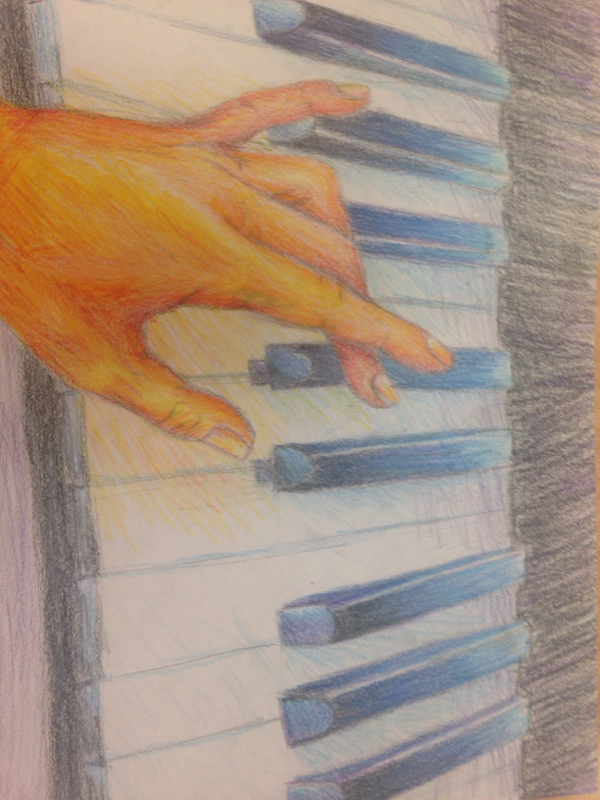
This was my final product. I ended up using colored pencils as my medium. I didn't really use my time wisely on this project, mainly because I was tired during class time. I ended up completing this at home at like midnight honestly. I used prisma colors for this and I really enjoyed it. They blend together a lot easier than regular colored pencils and overall they just work so much better. 
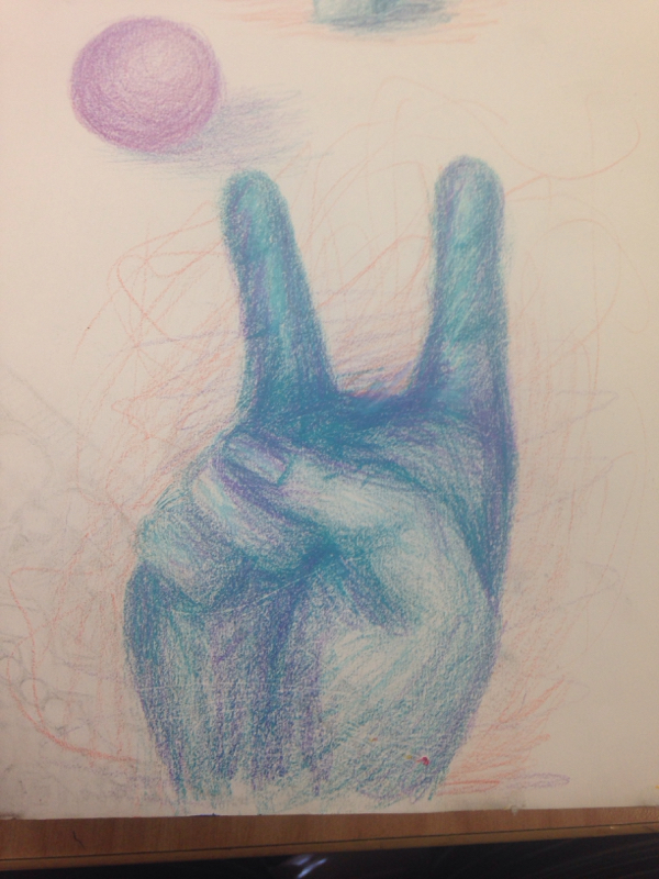
These were sketches that i did during the planning process. The painting was mainly just to figure out the composition I liked and using colors well. I didn't choose to do the flower cause it seemed really basic to me and even though it would be really easy, i decided against it. The hand i drew was basically trying to figure out the anatomy of the hand and practicing drawing that. It was also to learn the shading and detailing. I like the way the hand ended up in the final drawing, but in the sketch it looks a little messed up. These were my drawings for the candy project. 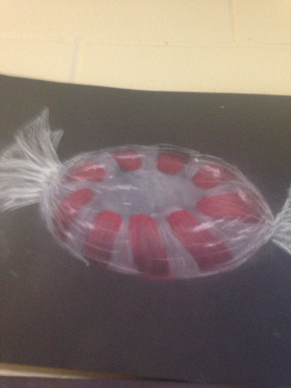
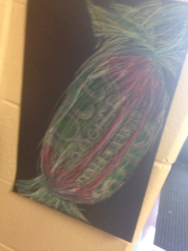
The first one was made with chalk pastels. I didnt really like using this material because of all the powder that gets everywhere and the inability for it to really be detailed or for colors to stand out in contrast against the black paper. The second one (the dum dums) were done in colored pencils. This material i favored over all the other ones, but I still don't like not being able to erase it and how hard it is to blend. I liked how you can make it detailed and it can fit into tight spaces and create contrast easily. The jolly rancher was made with oil pastels and it was my least favorite medium that I used. Layering it was difficult because if you want a bold color going against the black you have to press hard and once you do that you have a thick layer of wax and you can't add highlights to it anymore. I'm not pleased with how it ended up. For this project I painted in the style of Franz Marc.
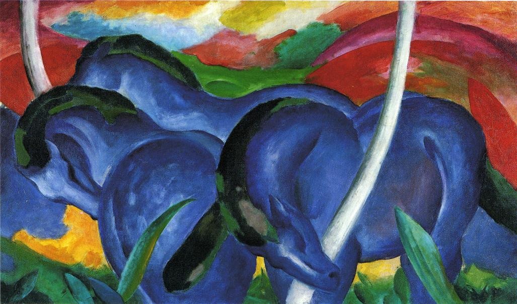
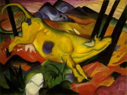
These were two of his paintings that I mainly used as a reference to create my painting. Franz was an animal painter, so I chose to paint a horse, thinking it would be easier than other animals. Also he was famous for his vibrant use of color, which I tried to incorporate into my painting. Similar to his, I also used landscape in the background since most of his work includes a natural setting. 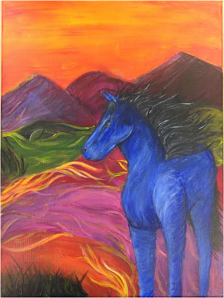
This was my final painting. The hardest parts of completing this painting would be trying to give the horse accurate anatomy (it has 3 legs in my painting) and to figure out which colors worked well together in the composition. Even though I used Marc's work as a reference, I tried to make the work my own by making the colors more intense and using more detail in shading in the horse. I tried to combine both together so people would know that it would be inspired by him, but it's my work. I definitely think I painted in his style more in the background, and made the horse more complex than he usually would. 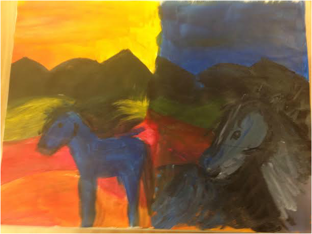
These were the colored sketches that I used for planning. Its very undetailed, but I didn't want to spend too much time on it to ensure that I'd complete the actual painting on time. My main focus for these was to figure out which color combinations to use, learn the general anatomy of a horse, and figure out which position/composition I favored most. I decided to go with the yellowish-orange sky and have the horse be farther away. It was unplanned to add the yellow streaks in the background, but I felt that the left side seemed a little boring and lacked contrast. Although my linework and movement is a little flawed, I think it still worked out.
One of the newer techniques that I learned how to do was applying a tonal background in a painting. I found it very helpful towards the painting and figuring out where everything was supposed to go. It was very unfamiliar to me, but the brown used benefited by not distorting the colors, but made them a little less intense and overwhelming since some of the paints can be translucent. | ArchivesJanuary 2015 Jessica
|
 RSS Feed